I’m, Sam Chance, a Principal Consultant at Cambridge Semantics. What drew me to Cambridge Semantics was the opportunity to help government and commercial organizations take advantage of the power of knowledge graph technology to satisfy their most demanding data integration and access requirements.
Here at Cambridge Semantics we build sustainable solutions that remove data silos and enable enterprise collective intelligence. This is accomplished via Anzo, our standards-based knowledge graph overlay that connects and contextualizes all your data sources, structured and unstructured. Helping customers achieve levels of insight and decision advantage that otherwise would not be possible.
In this blog post, I’m pleased to write about a use case I’m very familiar with: how to use knowledge graph to power a maritime common operating picture. This use case has a military tilt because of my background, but the concept is akin to businesses building a holistic customer 360. Indeed, knowledge graph technology is particularly useful for enabling this kind of capability.
In military lingo, a Common Operating Picture (COP) describes a knowledge network of a particular operation and all of its components (command centers, vehicles, personnel, bases, etc.). A commercial organization might compare this to managing supply chains, evaluating sales and marketing efforts, or discovering hidden customer opportunities.
The below demo uses structured reference data describing the particulars of Vessels and Ports, unstructured content from news feeds mentioning Vessels of interest and Ports, and streaming data describing Vessels’ position and status information.
This demonstration also implements a rules-based technique to resolve multi-source Vessel descriptions to “composite” Vessels, which provides a means to enrich information about vessels from multiple open sources.
We start with Anzo's main page and the four stages that represent a typical workflow. Stage one is onboarding structured and unstructured data. In the demo, we have a list of data (structured) and we have maritime news articles that mention ports and vessels of interest (unstructured).
In the next stage we create a model that represents the concepts and how they're related based on our domain of interest. Anzo automatically displays the source entities in different colors for easy identification. In the demo we collected vessel data from multiple sources and we want to track that provenance information.
The next stage is to blend the data. One of the cool things you’ll see here is that Anzo normalized all the datasets to the graph model and harmonized/described using the semantic model. Thanks Anzo. Clicking a bit further, you then create a Graphmart. The idea here is to select or pull in all the data and sources that represent the project for easy analysis.
With your Graphmart step complete, you can start exploring the knowledge graph. In our demo, you’ll see the graph depiction of the concepts in our model now have quantities tied to them. This means that the instances of the data in the knowledge graph are counted.
Now that we have the wanted datasets, we can jump into the Data Layers. In Anzo, the Data Layers represent loaded data and blended data from transformations or other computations of multiple data sources.
Jumping into analysis, it might make sense to build a dashboard to answer your question. In the example, we focus on the Common Operational Picture (COP). In our dashboard you see:
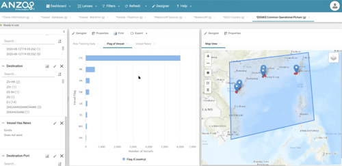
- A geospatial display of vessels and their tracks over time,
- A table distribution of the countries of the vessels in our area of interest, along with the raw tracking data that is connected directly to the AnzoGraph query engine as a streaming data source,
- Automatically populated filters from the knowledge graph.
By simply clicking the filters you can narrow your focus to your topic of interest. In our case, this was vessels in the news. As we filtered down Anzo automatically populates the vessel names along with a contextual excerpt from the original data file. This allows you to drill down even further if desired.
Using the geospatial display you can select vessels and Anzo will display the particulars about that vessel. Some of the associated data (or particulars) are computed and some is from the data source. What's really interesting here is that these particulars can come from multiple sources. In our example, we search for a vessel name and find multiple vessels under the same name. Looking at one of the vessel name entries we see that Anzo blended data from three data sources that may have been slightly different, but had a high degree of confidence that it was the same vessel.
I hope you found this information helpful and inspirational as you start brainstorming how and where knowledge graph can be most valuable in your organization. Please feel free to reach out with any questions you may have.
If you’re interested in exploring more knowledge graph use case demonstrations, I recommend watching our recent Knowledge Graph Demo Showcase.