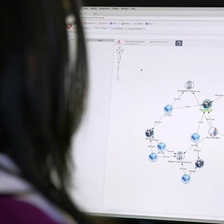
A picture is worth a thousand words they say, and this remains true for data discovery and analytics. For centuries, graphs and maps have been used to help us simplify, understand and convey large amounts of data in a universal manner. And with the evolution of technology, we can now visualize increasingly complex information at lightning-fast speeds.
 Next-generation graph databases and visualization tools, such as the Anzo Graph Query Engine (AGQE), have made big data more approachable and understandable to organizations. When combined with semantic technology, AGQE enables users to execute graph-based queries to gain insights from data in minutes, speeding decision-making as well as spurring unexpected new avenues of research and discovery.
Data visualization describes any effort to help people understand the significance of data by placing it in a visual context. Patterns, trends and correlations that might go undetected in text-based data can be exposed and recognized more easily with imagery. These valuable insights extracted from the data can help companies improve their operations and identify new opportunities.
Organizations that have been the most successful with their big data initiatives usually leverage data visualization. What are the key benefits for incorporating data visualization during data discovery?
- Experience accurate views of relationships, hierarchies and patterns within the data quickly to better facilitate investigations and root cause analysis while securing new business insights
- See how data points relate to each other in context, giving organizations a better way to understand complex connected data in an intuitive and interactive way
- Graph and visualization tools are much more cost-effective than hiring programmers for every question and analytic your organization needs to perform. Generally, the larger and more complex the data, the more an organization can benefit from data visualization techniques
- Gives organizations “oracle-like” powers to start with one set of facts and drill outward to ask innumerable other questions from huge and connected data sets. A graph database can let you easily add other data sets which can let you spot trends and adapt to changes more quickly
- Visualization techniques enable business analysts to more easily communicate the significance of data insights to business decision-makers
The explosion of data is causing a great deal of confusion among many organizations. Most have been very good at collecting and storing information, but have not done a very good job of making sense of that data and then being able to perform analytics on top of it. That’s where data visualization can play a critical role.
To learn more about the next-generation graph database and visualization tool, the Anzo Graph Query Engine, the key element of scale in the Anzo Smart Data Lake™, watch our recorded webinar Enterprise Analytics at Scale Using Graph Database.

